Library-museum task force convenes

This past few weeks have seen the first meetings for the city’s newly-formed “blue ribbon” task force for the combined downtown library-museum expansion project, which stalled in recent months following public comments questioning the viability of joint-use expansion.
Members of the committee, comprised of seasoned Riverside civic leaders, have been given the task of formulating a plan — namely whether the project should encompass a shared-space expansion as originally proposed or separate expansions. Although there are benefits of a combined expansion — shared overall costs, efficient use of flexible space and even natural synergies — the plan, as first proposed, fails to provide enough independent space for each entity.
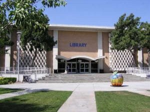
As it stands now, the city’s main branch library — aka, the “Central Library” — is housed within a 61,000 sq. ft. building that opened in December 1964. According to a study by a citizen’s group (RenewTheLibrary), Riverside’s current main library ranks 19th in space per capita (.21) when compared against 24 other Southern California cities with populations between 100,000 and 500,000. The study concluded the city’s main library would need to double in size just to reach the per capita median (.42) — a figure the combined library-museum expansion of 30,000 sq. ft. would clearly fail to meet.
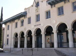
Across from the main library sits the Riverside Metropolitan Museum. Located within a building originally constructed in 1912 by the U.S. Postal Service, the museum initially occupied the basement beginning in 1948 (with the city’s police department taking up the remainder). Full occupancy by the museum came in 1965 upon completion of a new police headquarters nearby at 4102 Orange Street. Museum officials say the current building lacks the space and amenities needed for hosting major exhibits. They also cite the need for more storage space. Thus, the reasons for expansion.
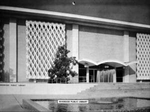
Finally, regardless of the final outcome — whether joint or independent expansion — our hope is that neither building’s exterior gets extensively altered, particularly the library’s striking mid-century modern architecture. Though ridiculed for most of its 44-year existence, the building’s exterior is in fact an excellent example of the New Formalism style of architecture (a style beginning to receive its due props elsewhere). Of course, we’ve gone on record before stating our admiration for the building’s style. And it appears others are beginning to appreciate it as well (ModernRiverside.com: one, two, three).
Upcoming meetings for the blue ribbon committee are scheduled for City Hall on May 19, and June 6 and 7.
Update
- PDF – Shared-space expansion outline (Jan. 2008 – Pfeiffer Partners via Riverside Public Library)
- Riverside Press-Enterprise – Raincross Group: Vital Expansions (opinion) (June 9, 2008)
Related
- Riverside Press-Enterprise – Riverside library/museum task force debates options (April 24, 2008) | Shared-space idea decried (Jan 17, 2008) | Riverside library to get more elbow room (April 24, 2007)
- City of Riverside – Riverside Public Library | Museum of Riverside (formerly Riverside Metropolitan Museum)
- Committee to Renew the Library
- Pfeiffer Partners Architects (now part of Perkins Eastman)
Previous
- RaincrossSquare.com – Library should remain downtown (July 2007)
Sources: Riverside Press-Enterprise (PE-20070424, PE-20080117, PE-20080424), City of Riverside, Pfeiffer Partners Architects
2025 PAGE UPDATE: Removed/updated outdated links to newspaper articles and third-party websites; corrected opening to December 1964 (from 1964/65).


Have you had an opportunity to review Pfeiffer Partner’s preliminary spatial conceptualizations of the original proposed expansion? Thus far, everything I’ve seen has called for keeping the current building, reconfiguring interior layouts, and largely just expanding around it.
While I’m not particularly fond of Modern architecture as a whole, I do agree that a mix of styles spanning trends and periods are essential to a healthy urban fabric, and am glad to see that initial plans call for keeping the building.
My biggest issues with the library are its squatness and the way it floats mid-block; the huge setbacks don’t allow the building to engage the streetscape at all and, being windowless, it almost takes on an air of elitism, as if it wished to distance itself from the city around it. This is why I favor expanding the facilities to the sidewalk edge, where they could be street oriented, possibly maintaining some sort of forecourt-walk up to the doors of the current facility, letting its facade remain visible.
In your opinion, how can the library/museum facilities best be expanded without sacrificing both buildings, particularly the library’s, historic significance and authenticity?
I honestly have such mixed feelings about the main library’s expansion. In some ways I don’t want to see the building changed by expansion because of its 1960’s uniqueness, but in other ways I would love to see it get a facelift in the front to “blend” it in more with the rest of Mission Inn Ave. buildings.
Perhaps a look that respects both and fuses them successfully will be the cure.
Instead of mission revival, maybe it could go in the direction of Spanish a bit more with the square window approach. Kind of like the Metropolitan Museum, Riverside Art Museum, or RCC A.G. Paul Quadrangle. Something with a solid stone feel matching the color of the mesh (I love that mesh 😉 ) on the library. That might be enough to merge the feel.
I can kind of picture a new two-story addition in front; one that actually has those Spanish square windows to let some light in as well. I wish I could see an example of just how much more space is needed as an addition so I could draw a rough example of what I’m envisioning.
On the flipside (no pun intended), if they somehow could expand via the back of the building leaving the front unchanged, I do wish they would get rid of that stupid blue “LIBRARY” they added to the front and maybe get a professional designer/architect to create a seal or some beautiful sculptural sign to go in place.
I apologize for a ridiculously long comment… maybe I shouldn’t write when I’m tired…
I am not thrilled about the mission revival look that is re-facing these buildings. The Pfeiffer Partners rendition shows a collonade on the front? Mixing these styles on the same building is a mistake in my opinion. Accentuating the current style of this building is really best. I agree with the forecourt and visible facade.
What a shame it would be to destroy this library a second time.
Matthew,
I disagree with your characterization of the library as elitist because of its position on the block and the lack of windows. I grew up in Riverside and spent many many many days within the walls of the Main Library. Its windowlessness gave (and gives) a cocoon-like atmosphere. This is so important to retain a quiet, safe environment. Like me, many of the kids who use the library may be seeking a refuge from an otherwise dangerous environment. Riverside has more than its share of crime that affects kids in its rougher neighborhoods every day. The Main Library’s current structure provides that sanctuary (especially in the lower level).
I also hope that the blue ribbon commission decides to retain the lawn in front of the library (and I heartily second the suggestions to build up or back). The front lawn used to be used for Movies on the Lawn for children and their families at dusk certain nights during the summer. It was a magical experience to watch classic Disney movies like Bedknobs and Broomsticks under the warm, pleasant Southern California air that Inland cities enjoy (the tradeoff for our lack of coastal breezes). It also provided a critical mass of people downtown, which is always a deterrant to crime.
Last, I am thoroughly opposed to the Mission style proposed for the library’s renovation. Even if you are not a fan of Mid-Century Modern architecture, the historical benefit of retaining Riverside’s unique examples must be considered. Let’s not fall victim to the oh-so-Californian tendency to demolish rather than renovate and preserve.
(Pub: Apr. 15 2008)
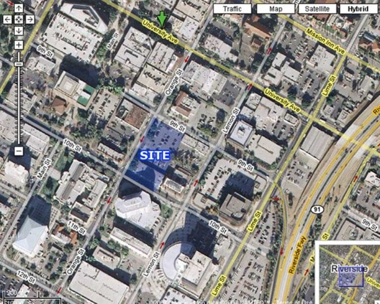
@Matthew — The entry has been updated to include a small rendering of the proposed shared-space expansion as well as a link to a PDF of the Pfeiffer Partners presentation given in Jan. 2008, in which the proposed floor plan changes and spatial additions are outlined.
We fully agree with the need for buildings — old and new alike — to better interact with the streetscape, particularly in downtown (where suburban-style setbacks definitely do not belong). However, in this case, we feel the current mini-park serves the immediate area well, and in fact, are not sure we want to see it lost (nor see the expansion encroach too much on the nearby church). Moreover, the city has not finalized where the Chinese Memorial Pavilion would be relocated if the expansion as proposed takes place. (We would hate to see this become one of those “packed away and forgotten” civic treasures due to the lack of a viable location.)
Thus, our preference would be to see the building grow up and/or behind, particularly on the Sixth and Lemon street sides, thereby sparing the mini-park and most — if not all — of the “dove screens.” However, such an expansion would likely consume much of the existing on-site parking — which, in truth is not much to begin with — but we feel the adjacent street parking and nearby garages should be adequate enough. (Btw, according to library sources, the current building was built to withstand the addition of another floor. Is it still possible/feasible? Not sure.)
As for the museum, we’ve seen recent expansion plans that, if we remember, basically expanded the existing facility in the back — including the addition of an elevator — all the while keeping the existing architectural style. However, these former plans might not offer the necessary — nor desired — space requirements.
Thus, because of the limitations of the museum site, we can see where a joint-use expansion would make sense, particularly for the museum, which proposed using the new space mostly for traveling/rotating exhibits. We find this particular aspect enticing, if only because the synergy of a joint-use facility would likely boost attendance, while also allowing additional historical items/exhibits to be displayed at the current museum site.
__________
@Jason — We too feel that expanding backward (and even upward) is better and hope whatever facelift that may come forth takes into account the “mesh” (aka the “dove screens”). Likewise, we’re confident that Pfeiffer Partners understands the need to incorporate nearby styles into any new building — whether it be up, out or back (we just hope some or all of the “dove screens” are somehow saved/incorporated).
Finally, we couldn’t agree more with the need to remove the truly unnecessary (not to mention unprofessional looking) “LIBRARY” from the front. Though a semi-recent addition, it just simply looks awful.